Handshake
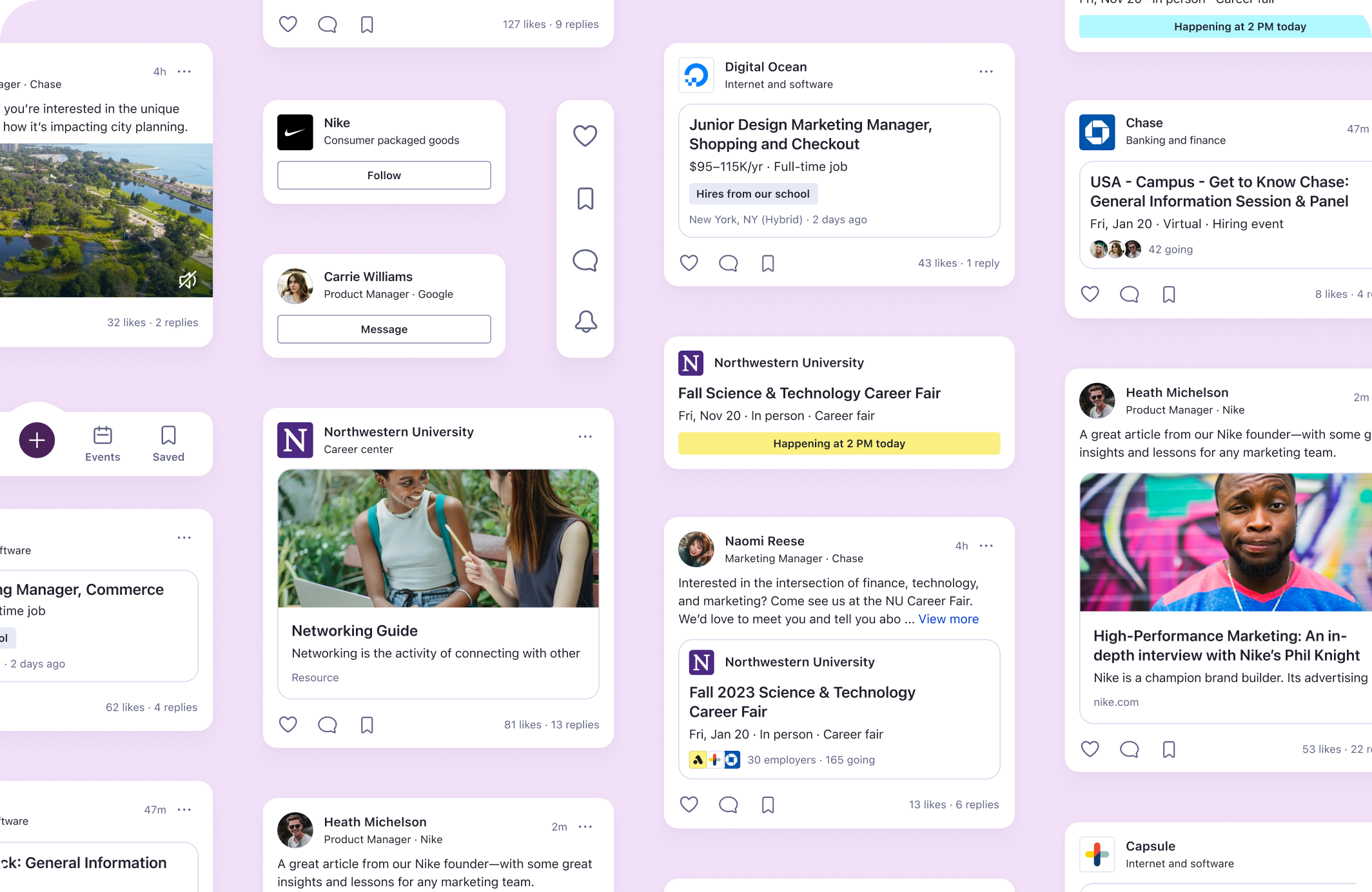
Our team was challenged to create an all-new feed experience—surfacing timely, relevant, and personalized content—helping students launch their careers.
Today, most students don’t know what jobs are available, whether they qualify, what jobs they need, whether there is a match to their personal preferences, and how to prepare. Students look for this information from other people they know or search for it across online platforms. The information is fragmented at best, and not available at worst. Our goal with the feed is to solve this problem.
PLATFORM
Mobile
Web
TIMELINE
12 months
MY ROLE
Strategy
Research
Prototyping
RITE testing
UI/UX design
Student-first approach
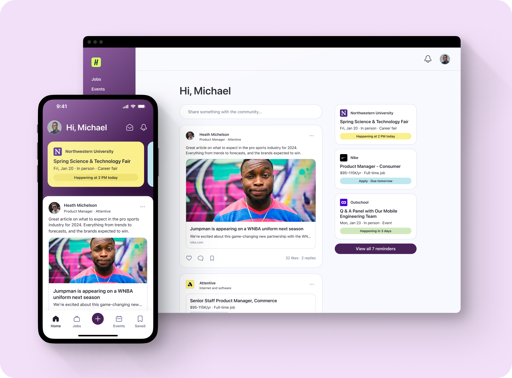
The Handshake ecosystem is made up of three sides—universities, employers, and students. While it was important to consider all sides of the marketplace, the student user was at the forefront when solving for this 0-1 feed experience.
Meeting student needs
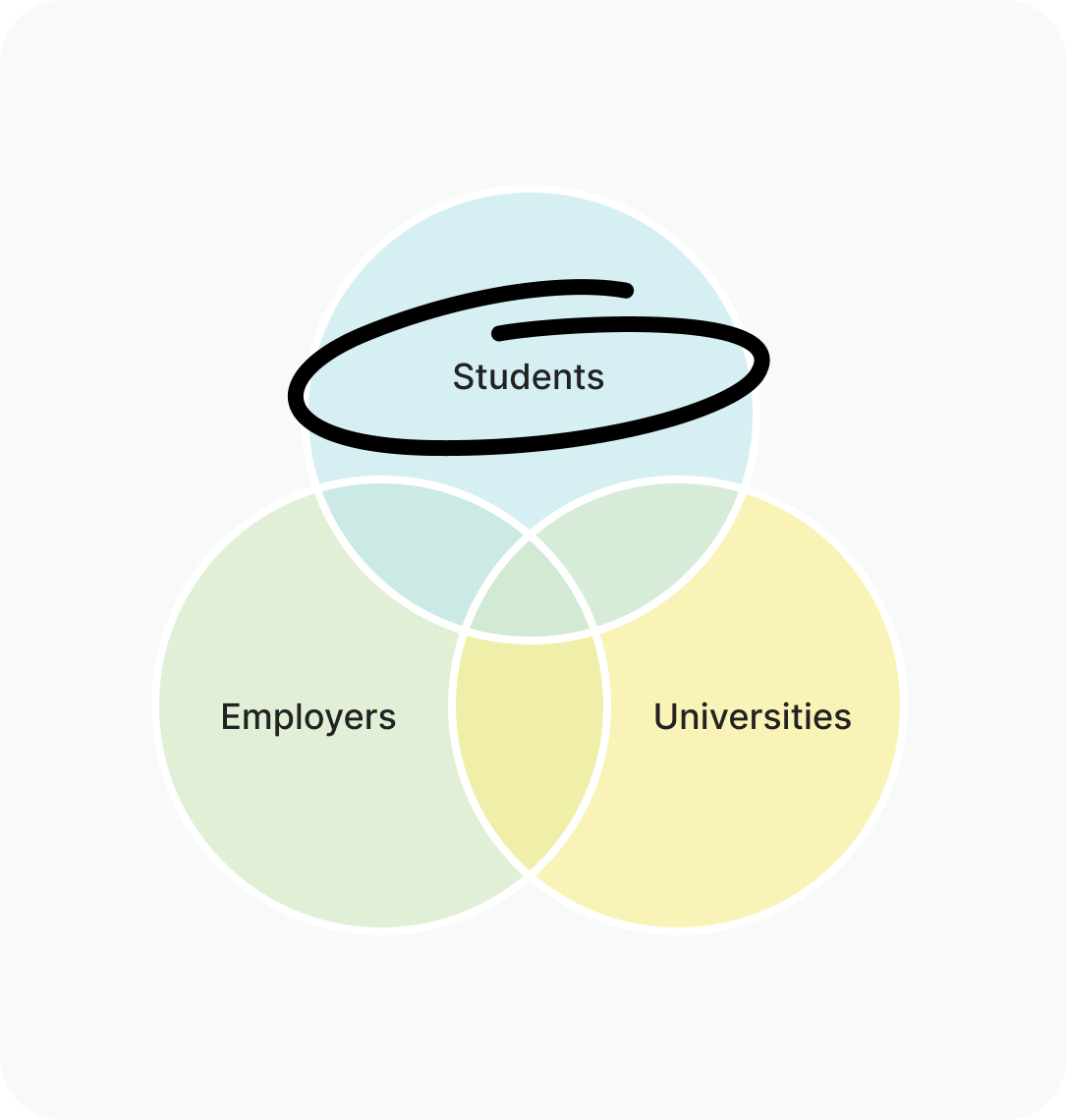
DISCOVERY
Personalized content that meets students where they're at
ACTION
Reach out to peers, follow employers, react to posts, and save jobs and events
GUIDANCE
Watching videos, reading articles, and getting market insights
CONNECTION
Messaging with peers, following employers, and conversing in threads
Business goals
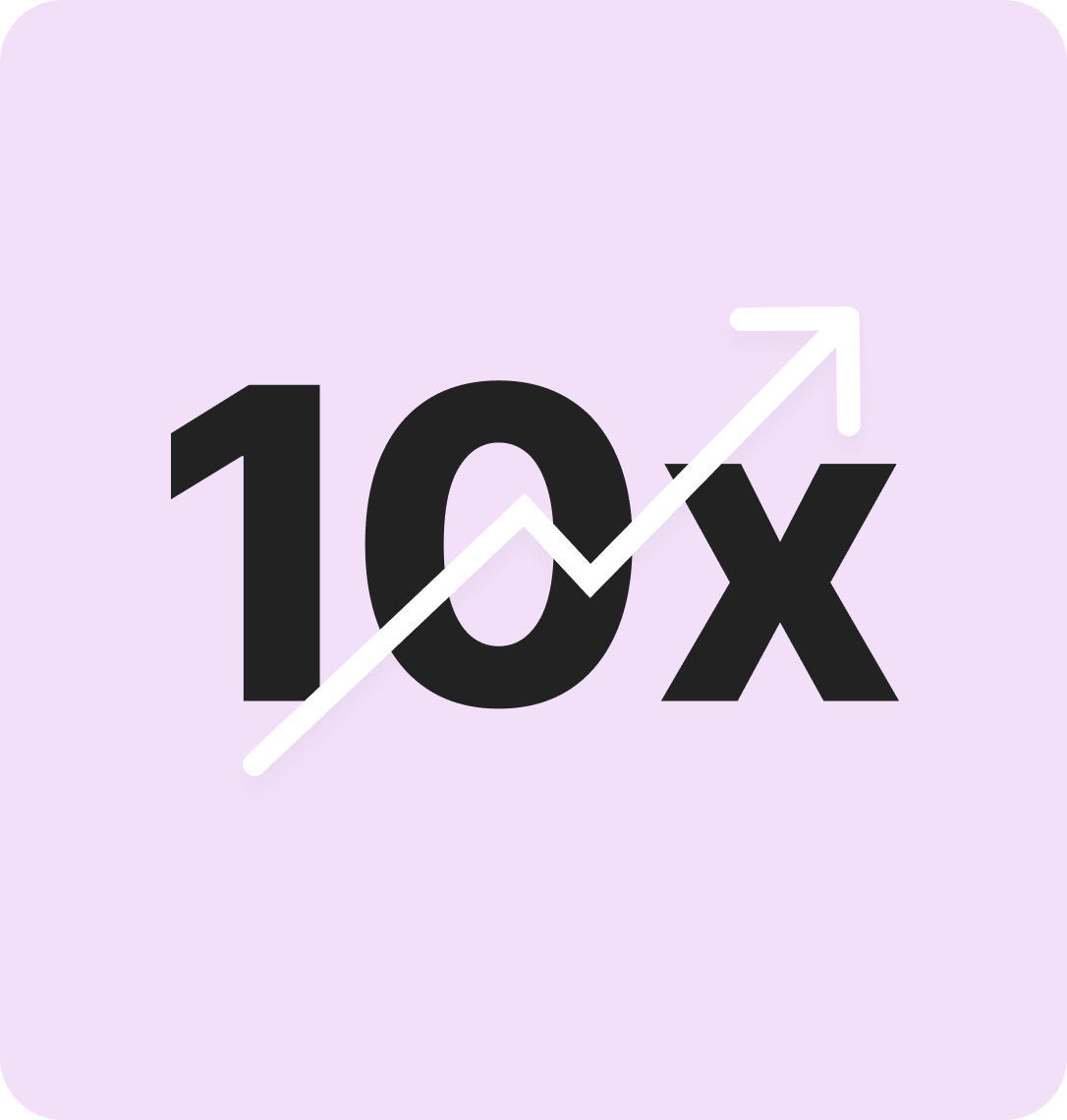
The top-line metric we were going after was to increase our monthly active users (MAU) by 10x—going from 2.2M to 22M. We believed by creating relevant and highly personalized content, the feed could become an indispensable resource that students would want to visit again and again.
Discovery and exploration
Competitive analysis
Student archetypes
Product differentiation
User pain points
Information architecture
Student user flows
Wireframes
Visual design
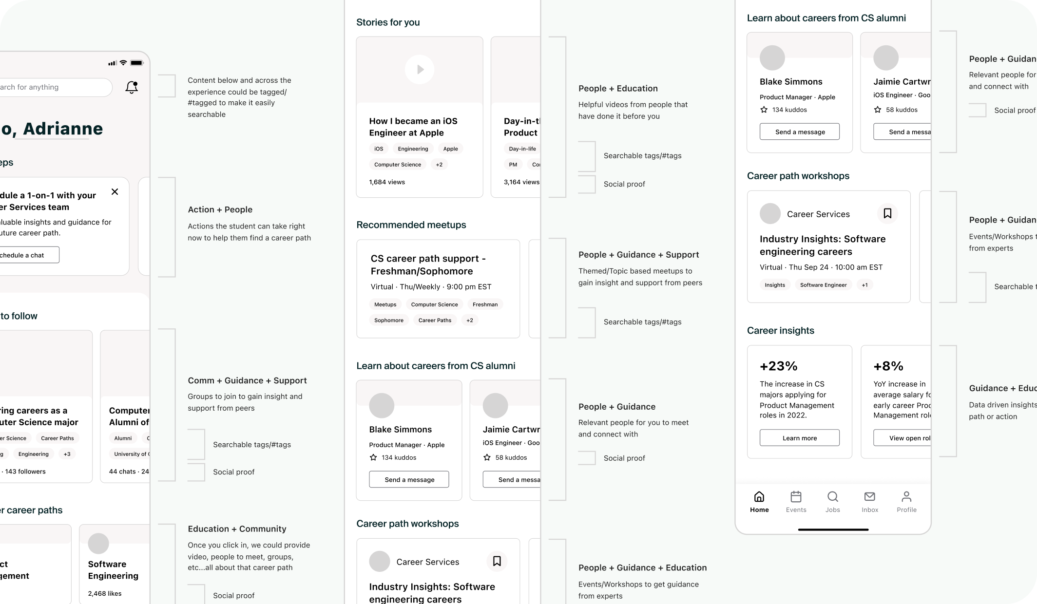
Research and testing
A significant step in our process included a 3-day summit where we conducted Rapid Iterative Testing and Evaluation (RITE) testing with a group of Handshake student users. This provided our team the opportunity to pressure test our initial concept—learn and iterate—and test again. The insights and learnings that would typically take a product team weeks or even months to gain, we were able to get in just a few days.
Student quotes
“This looks like a whole feed on Instagram but definitely more productive...this would be the more filtered out, useful student version.”
— Junior, Health Science
“It’s not only a place to find a job posting, but it’s also a place to get advice on how to apply to those job postings...not what I expected but it’s something I’m pleasantly surprised by.”
— Senior, Information Systems
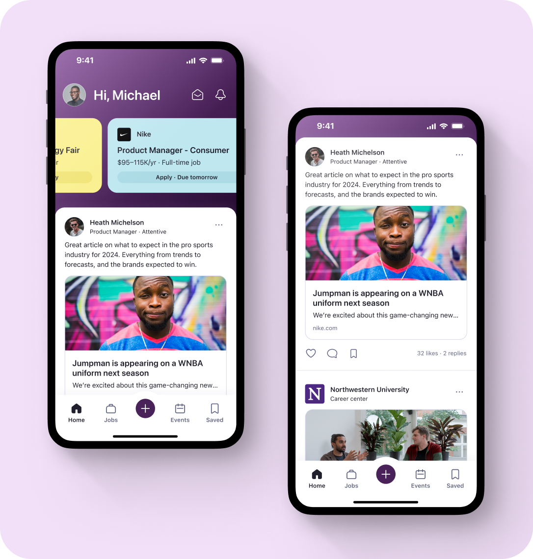
Build and launch
From the thorough research, testing, and multiple design iterations, we were confident with where we had landed and ready to build and launch the all-new feed. We decided to start with a small but valuable subset of the content types we had envisioned—allowing the team to move fast, lower the cost and risk, and get the experience into the hands of students to understand if we had a product-market fit.
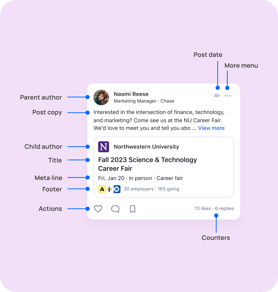
A card component that scales
With the new feed came a new content card component that needed to be successful for a variety of future content types but also surface areas, beyond just the feed. I worked closely with cross-functional teams, including Engineering and Design Systems, to create a global card component that could solve our current needs but scale for the future.
Outcome
We started with a small beta launch, releasing to just 15 schools in April—from there, we saw positive results and continued to release to more schools as we iterated on existing content types and experimented with new ones. Since the initial beta launch, the feed has now been released to all 1200+ universities and 100% of student users.
RESULTS
8.5% increase in mobile sessions
22% increase in clicks to events
62% increase in time on the feed
